The iPhone has dominated the mobile phone market since it first burst onto the smart phone scene. There have been other competitors but no company or phone has come close to being able to offer what Apple does with the iPhone. That is, until now.
The Palm Pre was voted the most highly anticipated new gadget of all of 2009 and may be the biggest, best and most exciting handset announced in years. Whether you are looking for a new phone, already own a smart phone or are just looking for some more information on smart phones, keep reading for a full review of the all new Palm Pre and what we love about it.
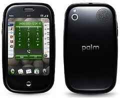
One of the most striking features off the bat is how small the Palm Pre is. It is not clunky and actually extremely light considering all of the features it holds and the applications it can run. With that said, it is not nearly as thin as the iPhone, but that is mostly due to the fact that it is a slider. If you want a better idea of its size, it is relatively the same as an iPod classic.
Right from the get go you can see that a lot of thought and detail was put into the design of Palm Pre’s Web OS UI and UX in order to keep it efficient and easy to use. The Palm Pre’s WEB OS UI and UX are dazzling. While the gadget is still relatively new there have been no reports of choppy video or any lags at all. There are a ton of applications that you can use without hassle and while they keyboard system is not spectacular, it gets the job done.
Palm decided to stick with the vertical slider QWERTY keyboard as they didn’t see the horizontal type being much more effective. Also the Palm Pre is one of the only smart phones that is using the vertical slider, so it makes it stand out from everything else.
One of the coolest little add-ons is the gesture bar. It allows users to use the phone with one hand, when on the go. That has been the one problem with the iPhone. If you are on the move it can be quite difficult to navigate the touch screen with just one hand. The gesture bar allows you to effortlessly move from application to application even while running for the train or hailing a taxi.
In terms of any negatives the design is useful and original but it could have had a little more. In a few ways it looks a little too “cute” and a larger screen could have made the applications a whole lot better. With that being said, that is the only real drawback and could just be a matter of personal preference.
The way the internet is used on the phone is also quite impressive as you can pretty much do anything from checking your email, viewing sports highlights, making presentations or even uploading videos to youtube.
Possibly the most exciting part about the launch of the Pre Palm is the fact that Palm is working to make it a universal smart phone. While we are all aware that the iPhone only “technically” works with AT&T, there is hope that you will be able to use the Pre Palm with any mobile service provider in the near future. This will help steer away from all the jail-breaking and unlocking that has surfaced with regards to the iPhone. A universal smart phone makes a lot more sense for consumers and it should be your choice to use the phone you purchased in any way that you like.


